# Designing Scalable User Interfaces: A Guide for Mobile and Desktop
Written on
Chapter 1: Understanding Scale in Design
In the realm of art and design, scale refers to the size relationship between objects, particularly how the dimensions of artwork compare to the viewer's own body. This principle is crucial when designing user interfaces for various platforms, as it ensures that users can effectively engage with different components. Typically, this involves creating at least two different scales: one for mobile and another for desktop.
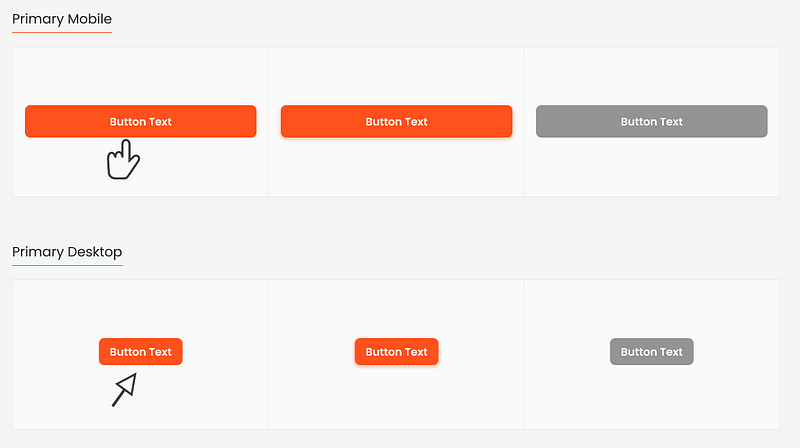
Designing for devices such as mobile phones, tablets, and desktops requires the development of scalable styles and components. This consistency is vital for user experience across different viewports. Generally, mobile and tablet devices share a common scale, while desktops have their own distinct scale.
- Mobile Scale: 360px to 1279px
- Desktop Scale: 1280px and above
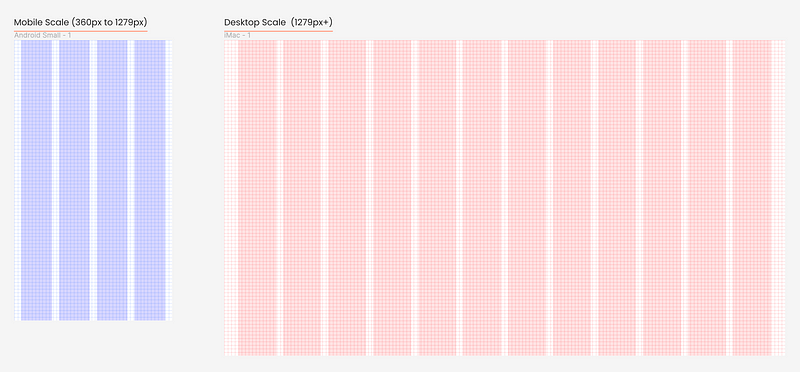
It's important to clarify that this discussion does not propose a responsive layout and grid scaling method, which typically involves multiple breakpoints. Instead, we focus on platform-specific scaling for mobile and desktop.
Essential Guidelines for Design Scalability
Here, we present a set of principles designed to uphold standards and patterns related to scalability within a design system.
#### Responsive Layout
A layout is defined as the arrangement of predetermined elements—like images, text, and components—on a display. Uniform elements and spacing are employed to promote consistency across various platforms and screen sizes.
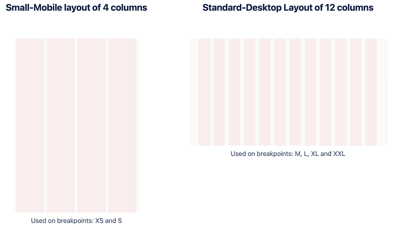
- Desktop Layout: 12 columns
- Mobile Layout: 4 columns
On mobile devices, the screen accommodates four columns, with widths adapting to the screen size. Each column occupies 25% of the grid's width. In contrast, the desktop layout features twelve columns, with each column representing approximately 8.33% of the grid.
#### Spacing
The 8px grid is consistently utilized across both mobile and desktop scales. This grid is favored for its even increments, which simplify design scaling and maintain consistency. The spacing between components is measured in increments of 8 (8, 16, 24, etc.). For a deeper understanding of spacing, refer to the article on spacing guidelines for designers.

#### Component Proportions
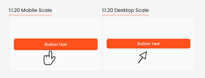
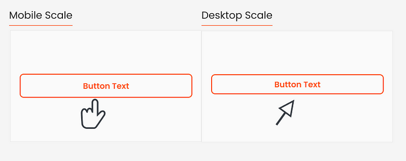
Desktop components tend to be smaller, as users interact with them using a mouse or trackpad, whereas mobile components need to be larger to accommodate finger interactions. A recommended scale ratio is either 1:1.20 or 1:1.25, indicating that mobile components should be around 20% to 25% larger than their desktop counterparts.
#### Typography
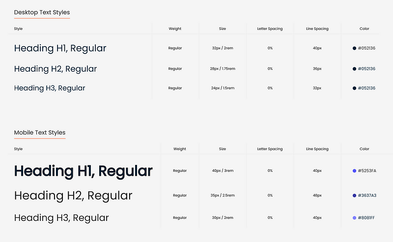
Similar to component ratios, typography scales may differ between mobile and desktop. Mobile text should ideally be 1:1.20 to 1:1.25 times larger than desktop typography, with sizes rounded to multiples of 4px or 8px for consistency. For example, a base size of 24px multiplied by 1.20 equals 28.8px, which rounds down to 28px.
#### Iconography
To enhance harmony and balance within your design, creating scalable icon sets tailored for different devices is crucial. A practical approach is to develop two sizes for mobile and two for desktop, although having a single size for each scale is also viable.
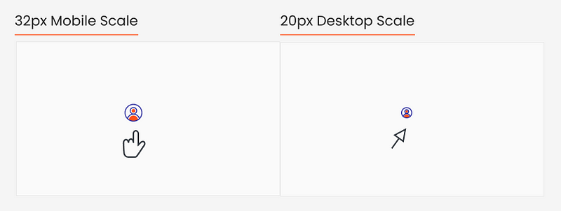
For instance:
- Mobile Scale: 32px
- Desktop Scale: 20px
Alternatively, you might consider:
- Mobile Scale: 24px and 32px
- Desktop Scale: 16px and 20px
#### Borders
While proportions may vary, borders can remain consistent across different scales. However, you might choose to adjust the border thickness for aesthetic reasons. Ultimately, the visibility of the border is paramount across all devices.
#### Device-Specific Scales
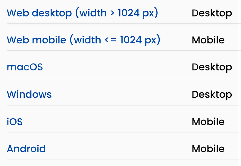
The appropriate scale often depends on the device in use. For example, Android or iOS phones and tablets typically employ a mobile scale, while Mac or Windows computers adhere to desktop standards.
Speed and Purpose
Implementing a design system that accommodates scaling for both mobile and desktop enhances your team's efficiency in UI design and documentation. The ultimate goal is to create a seamless user experience across all devices, ensuring that touch interactions on mobile and cursor-based interactions on desktop are user-friendly. Adequate interaction areas are essential for effective engagement.
Video Description: Explore the best mobile options for you with clear suggestions tailored to your needs in this informative video.
Video Description: A retrospective look at LG Mobile's unique approach to phone design over the last two decades.
Thank you for reading! I'm Oriol, a product designer dedicated to solving challenges through research and design. Feel free to connect with me on LinkedIn or visit my portfolio website.