Creating Complex CSS Animations with ChatGPT: A Guide
Written on
Chapter 1: Introduction to CSS Animations
In my previous writings about AI tools like ChatGPT, I've often highlighted its efficiency in helping me accomplish tasks swiftly. This efficiency has allowed me to dedicate more time to exploring new skills, experimenting with different income streams, and enjoying quality time with my family.
With this newfound time, I decided to take on additional freelance projects. Recently, I received an assignment to create a blog post focused on CSS animations, which piqued my interest. To ensure I delivered a compelling article, I delved into research about CSS animations.
During my research, I stumbled upon the exciting concept of combining various animations, which inspired me to experiment. I initiated my exploration by asking, "Can you provide a complex example of executing multiple animations simultaneously using HTML and CSS?"
I was thrilled with the response, as it included an insightful code snippet that perfectly matched my inquiry.
| linenos: |
|---|
<!DOCTYPE html>
<html lang="en">
<head>
<meta charset="UTF-8">
<meta name="viewport" content="width=device-width, initial-scale=1.0">
<style>
body {
display: flex;
justify-content: center;
align-items: center;
height: 100vh;
margin: 0;
background-color: #f0f0f0;
}
.scene {
width: 400px;
height: 400px;
position: relative;
perspective: 1000px;
}
.object {
width: 50px;
height: 50px;
position: absolute;
background-color: #3498db;
border-radius: 50%;
animation: move 3s infinite linear alternate, colorChange 5s infinite alternate, scale 2s infinite alternate;
}
@keyframes move {
0%, 100% { left: 0; top: 0; }
50% { left: 300px; top: 300px; }
}
@keyframes colorChange {
0%, 100% { background-color: #3498db; }
50% { background-color: #e74c3c; }
}
@keyframes scale {
0%, 100% { transform: scale(1); }
50% { transform: scale(1.5); }
}
</style>
<title>Multiple Simultaneous Animations Example</title>
</head>
<body>
<div class="scene">
<div class="object"></div></div>
</body>
</html
The output of this code was impressive.

However, I thought there was room for improvement. After making some adjustments, I asked, "Can you give me a complex example of using multiple animations with HTML and CSS?"
Here’s the refined code it provided:
| linenos: |
|---|
<!DOCTYPE html>
<html lang="en">
<head>
<meta charset="UTF-8">
<meta name="viewport" content="width=device-width, initial-scale=1.0">
<style>
body {
display: flex;
justify-content: center;
align-items: center;
height: 100vh;
margin: 0;
perspective: 1000px;
}
.cube-container {
position: relative;
width: 200px;
height: 200px;
transform-style: preserve-3d;
animation: rotate 10s infinite linear;
}
.cube {
width: 200px;
height: 200px;
position: absolute;
transform-style: preserve-3d;
}
.face {
width: 200px;
height: 200px;
position: absolute;
background-color: rgba(0, 0, 0, 0.8);
border: 2px solid white;
display: flex;
justify-content: center;
align-items: center;
font-size: 24px;
color: white;
}
.face1 { transform: rotateY(0deg) translateZ(100px); animation: fadeInOut 3s alternate infinite; }
.face2 { transform: rotateY(90deg) translateZ(100px); animation: slideInOut 3s alternate infinite; }
.face3 { transform: rotateY(180deg) translateZ(100px); animation: rotateColor 3s alternate infinite; }
.face4 { transform: rotateY(-90deg) translateZ(100px); animation: scaleInOut 3s alternate infinite; }
.face5 { transform: rotateX(90deg) translateZ(100px); animation: rotateX 6s infinite linear; }
.face6 { transform: rotateX(-90deg) translateZ(100px); animation: rotateY 6s infinite linear; }
@keyframes rotate {
0% { transform: rotateY(0deg); }
100% { transform: rotateY(360deg); }
}
@keyframes fadeInOut {
0%, 100% { opacity: 0; }
50% { opacity: 1; }
}
@keyframes slideInOut {
0%, 100% { transform: translateX(-100%); }
50% { transform: translateX(0); }
}
@keyframes rotateColor {
0% { background-color: rgba(0, 0, 0, 0.8); }
100% { background-color: rgba(255, 0, 0, 0.8); }
}
@keyframes scaleInOut {
0%, 100% { transform: scale(1); }
50% { transform: scale(1.5); }
}
@keyframes rotateX {
0% { transform: rotateX(0deg); }
100% { transform: rotateX(360deg); }
}
@keyframes rotateY {
0% { transform: rotateY(0deg); }
100% { transform: rotateY(360deg); }
}
</style>
<title>Multiple Animations Example</title>
</head>
<body>
<div class="cube-container">
<div class="cube">
<div class="face face1">1</div>
<div class="face face2">2</div>
<div class="face face3">3</div>
<div class="face face4">4</div>
<div class="face face5">5</div>
<div class="face face6">6</div>
</div>
</div>
</body>
</html>
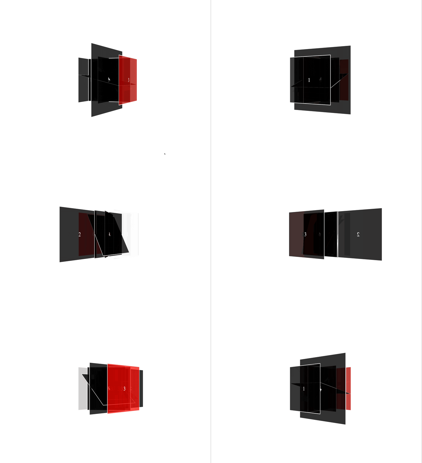
The resulting animation was simply stunning.

As a web development enthusiast, I can attest that crafting precise animations typically requires considerable time and effort. It involves visualizing the desired movement and writing extensive code to actualize that idea.
Yet, what’s truly impressive is how ChatGPT can generate remarkable animations with just a few simple prompts. The speed and creativity of the animations it produces are truly captivating.
By taking the time to formulate detailed and specific requests, one can witness the astonishing animations that can be brought to life in mere minutes.
I hope you find this information helpful!
Chapter 2: Utilizing ChatGPT for CSS Animation Creation
In this video, I experimented with ChatGPT to design CSS animations using the GoHighLevel Funnel Builder. You'll see a practical demonstration that showcases the capabilities of AI in animation creation.
This step-by-step tutorial explains how to leverage ChatGPT for crafting CSS animations in GoHighLevel websites, providing insights and examples for effective usage.
Thank you for reading!